Website Homepage Design for a Company: What to Put First
In this article 15 sections
- 1.What a Company Homepage Has to Do in the First Few Seconds
- 2.Website Homepage Design Starts With Your Visitors
- 3.What to Put First: The Section Order That Works
- 4.Writing the Hero Section: Headline, Supporting Line and One Button
- 5.Proof That Builds Trust on a Corporate Homepage
- 6.Menus and Labels Visitors Understand
- 7.Web Homepage Design for Phones and Slow Connections
- 8.Speed: What Slows a Homepage Down
- 9.Homepage SEO: Titles, Headings and Text Google Can Read
- 10.Homepages for Corporate Groups With Several Companies
- 11.Best Homepage Design Habits and Common Mistakes
- 12.How to Brief and Approve Your Website Homepage Design
- 13.How to Tell Whether Your Homepage Is Working
- 14.How Nexteio Can Help With Your Website Homepage Design
- 15.Frequently asked questions
Website homepage design decides what a visitor understands about your company in the first few seconds, and whether they look further or close the tab. For a company in Bangladesh, the homepage is often the first thing a foreign buyer, a bank officer, a job applicant or a possible partner sees before they ever call you. If it opens with a slow slider and a vague welcome message, those people leave with a weaker picture of your business than the one you have earned.
Most homepage problems are not about colors or fonts. They are about order. The page tries to say everything at once, puts the least useful things at the top, and hides the one action the company actually wants: a call, a quotation request or an email.
A good homepage works more like a reception desk than a brochure. It greets people quickly, tells them they are in the right place and points each visitor to the right room.
This guide explains what to put first on a company homepage, what can wait further down and what to drop. It covers the hero section, proof, menus, phone layout, speed, basic SEO, group companies with several sister concerns, and how to brief a designer and get the page approved inside your organization.
What a Company Homepage Has to Do in the First Few Seconds
Good website homepage design begins with the questions every visitor brings, even if they never say them out loud. Your homepage has to answer them in order, before the visitor loses patience. If any answer is missing or buried, the rest of the page has to work much harder.
- Who are you? Your name and logo, clearly visible, so the visitor knows they found the right company.
- What do you do? One plain sentence about your products or services, not a slogan.
- Is this for me? A hint about who you serve: export buyers, hospitals, factories, local retailers or government offices.
- Can I trust you? Early signs that you are real and experienced, such as certifications, project photos or known clients.
- What do I do next? One obvious action, such as calling, requesting a quote or viewing products.
Notice what is not on that list: your mission statement, the chairman's message, a history timeline or a news ticker. Those can live on the website, but they are answers to questions that come later, if at all.
It also helps to remember what the homepage is not. It is not the only page people see. Many visitors arrive on an inner page from Google, an ad or a shared link. The homepage is where people land when they type your name, scan a QR code on a brochure, or click the logo to get their bearings. Its job is to orient them and send them on, not to hold every detail.
Website Homepage Design Starts With Your Visitors
Before anyone opens a design tool, list the people who visit your homepage and what each of them wants. A corporate homepage usually serves four to six groups at once, and the order of the page depends on which group matters most to the business.
| Visitor | What they want to know | What the homepage should give them |
|---|---|---|
| Overseas buyer | Capacity, product range, compliance, real facilities | Product categories, certifications, factory photos, a quote button |
| Local corporate client | Services, past work, how to start | Service cards, project examples, a clear contact route |
| Job seeker | Is the company stable, are there openings | A careers link in the menu or footer |
| Supplier or vendor | Who handles purchasing | A procurement or general contact in the footer |
| Bank, investor or partner | Scale, structure, leadership | A short company summary and a link to the about page |
Now pick one primary visitor. For a garment exporter, it is the buyer. For an IT services firm, it is the business client. For a trading company, it may be the dealer network. The top half of the page is designed for that person. Everyone else gets a clear path through the menu, a section further down or the footer.
This one decision settles most arguments later. When a department head asks for their item to be placed at the top, the answer is simple: does the primary visitor need it in the first screen? If not, it goes lower or onto its own page.
What to Put First: The Section Order That Works
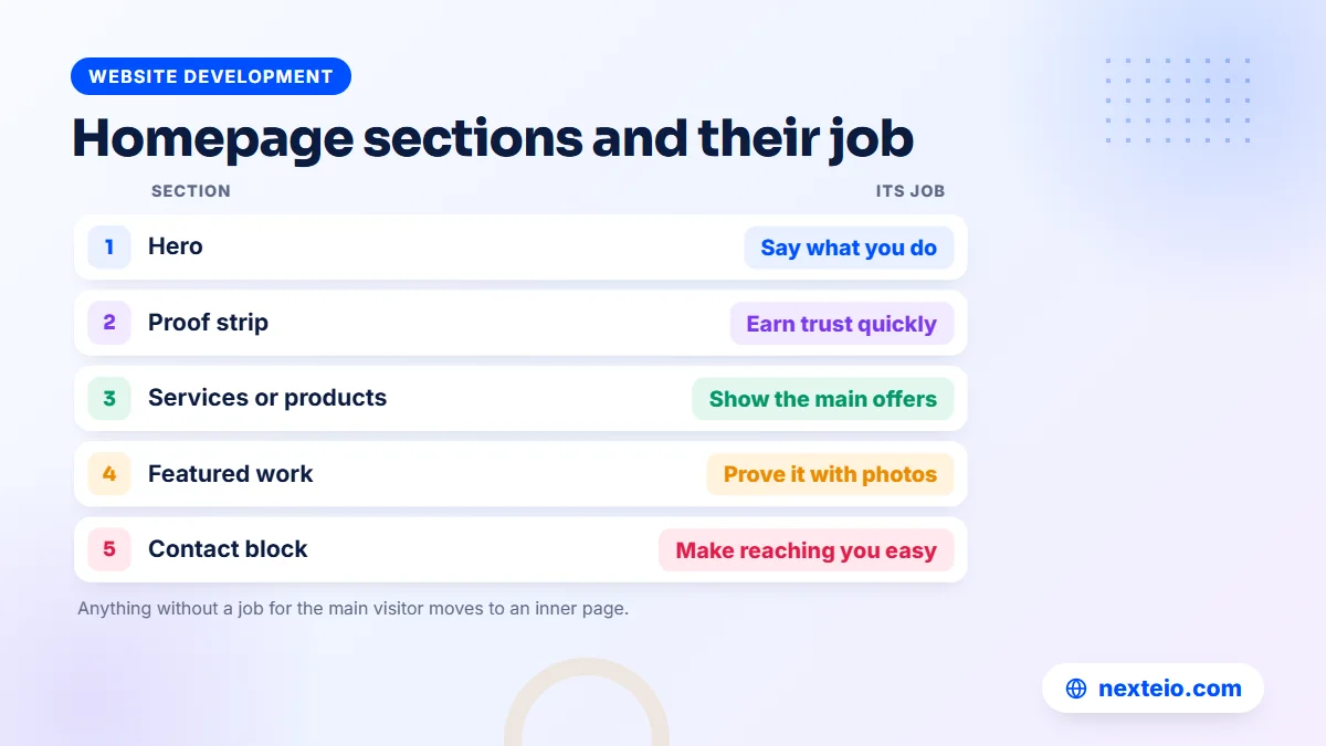
There is no single template that suits every company, but most strong corporate homepages follow a similar flow. It moves from "who we are" to "what we offer" to "why trust us" to "how to start". Here is an order that works for most companies, with what each block should hold.
- Header: logo, a short menu, and a phone number or contact button visible on every screen size.
- Hero section: a plain headline about what you do, one supporting line, one main button and a real photo.
- Proof strip: a slim row of certifications, sectors served or client logos used with permission.
- Main services or product categories: three to six cards, each with a short line and a link to its own page.
Those first four blocks carry most of the weight. The rest of the page builds confidence and leads to contact:
- How you work or why choose you: three or four concrete points, not general claims.
- Featured work: selected projects, products or installations with real photos.
- Testimonials or client voices: short, named quotes used with permission.
- Latest updates (optional): news or articles, only if you will keep them current.
- Contact block and footer: address, phone, email, map link, key pages and social links.
You can merge or drop blocks. A small consultancy might combine blocks five and seven. A manufacturer might put featured products before services. The principle stays the same: the first screen answers "who and what", the middle answers "why you", and the end answers "how to reach you".
Keep the page reasonably short. A homepage that scrolls through fifteen blocks starts repeating itself, and visitors stop reading long before the end. If a block does not help the primary visitor decide or act, it probably belongs on an inner page. When we plan a custom company website, this section order is usually agreed on paper before any visual design starts, because changing order later costs far more than changing colors.
Writing the Hero Section: Headline, Supporting Line and One Button
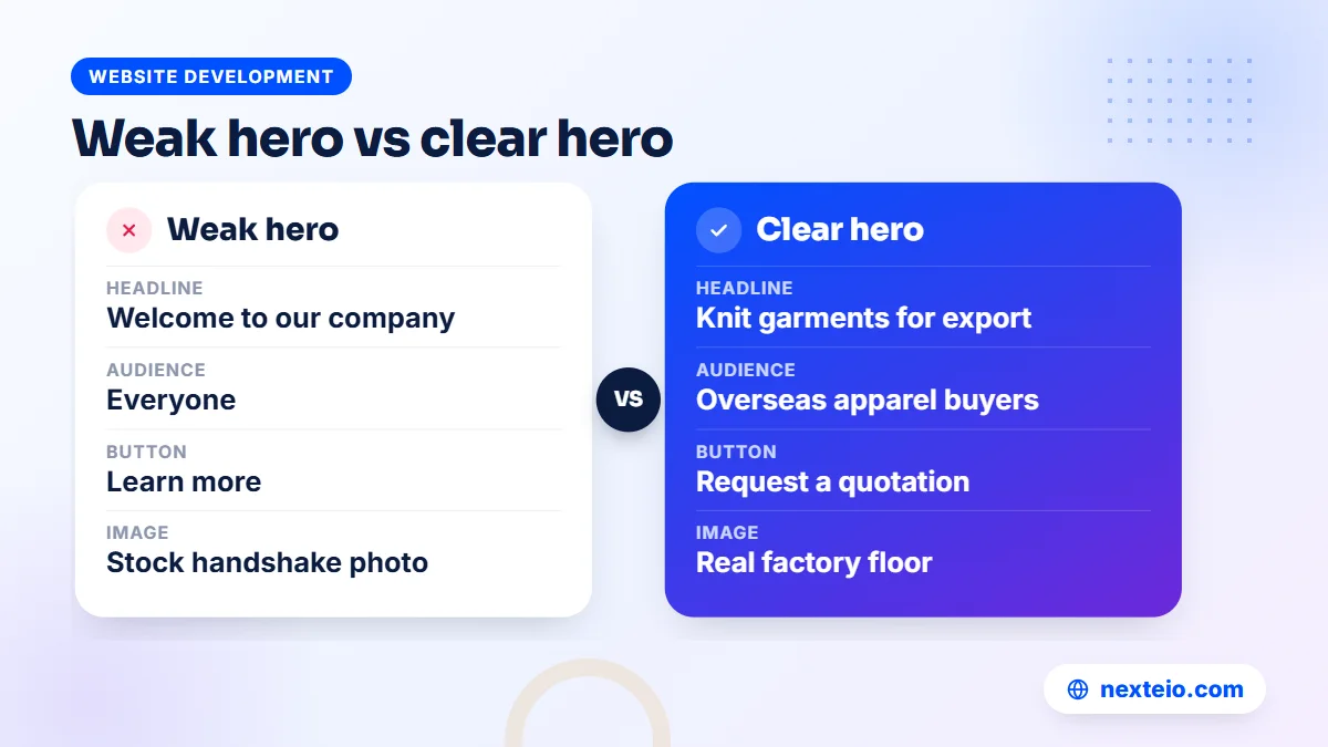
The hero is the first screen a visitor sees before scrolling. It carries more weight than any other part of your website homepage design, and it is also where companies most often waste space. A large photo of a handshake with "Welcome to ABC Group" across it tells the visitor almost nothing.
The headline
Write the headline as if you were answering a stranger who asked, "What does your company do?" Use the words your customers use. Compare these pairs:
- "Excellence in Every Thread" versus "Knit garments for export, made to buyer specifications".
- "Your Trusted Technology Partner" versus "Payroll and HR software for factories in Bangladesh".
- "Building Tomorrow" versus "Commercial buildings and steel structures, from design to handover".
The second version in each pair is less poetic, but a buyer or client understands it in one read. It also helps search engines, because the headline usually becomes the main heading of the page.
The supporting line
Below the headline, add one or two short lines that narrow things down. Say who you serve, what makes you different, or a key fact you can prove. For example: "Serving apparel buyers in Europe and North America from our own knitting, dyeing and sewing units." Keep it under about thirty words, and avoid stacking adjectives.
The buttons
Give the hero one main button and, at most, one quieter second option. Label them with the action, not a generic word. "Request a quotation", "Book a factory visit" or "See our products" work better than "Learn more" or "Click here". The main button should lead somewhere that helps the visitor act, such as a short form or a product page.
The image
Use a real photo of your work, your facility or your team, taken in good light. Stock photos of smiling people in suits look the same on hundreds of sites, and buyers recognize them. If you are thinking about a slider, consider one strong image instead. Many visitors scroll past before the second slide appears, and every extra slide adds weight to the page.
Proof That Builds Trust on a Corporate Homepage
After the hero, visitors want a reason to believe you. Proof does that far better than adjectives. The strongest proof is specific, checkable and current. Useful types of proof include:
- Certifications and audits you actually hold, shown with the certificate name rather than a vague badge.
- Client or partner logos, used only with permission and only for real, recent relationships.
- Real photos of your factory floor, warehouse, office, project sites or delivered work.
- Accurate figures such as production lines, branches or projects completed, if you can back them up.
- Short testimonials with the person's name, role and company, given with their consent.
- Memberships in trade bodies or chambers you belong to, linked where possible.
Be strict about accuracy. A buyer who visits your factory and finds fewer machines than the website claims will doubt everything else you said. The same goes for client logos. Showing a brand you worked with once, years ago, as if it were a current client can create real problems if someone checks.
In website homepage design, placement matters too. A slim proof strip right under the hero gives quick reassurance. Deeper proof, such as project case pages or a full list of certifications, can sit further down or on its own page. Link to it rather than cramming everything into the homepage.
For many Bangladeshi companies, real photos are the most underused form of proof. A clean photo of an organized production floor or a finished installation tells a foreign buyer more than any paragraph. If you plan to rebuild your company website, set aside a day for proper photography before the design starts.
Menus and Labels Visitors Understand
The menu is part of your website homepage design, and it shapes how people move through the whole site. Keep the top menu to around five to seven items. More than that, and the choices start to blur, especially on a phone where the menu folds into a single button.
Use plain labels that match what people are looking for. "Products", "Services", "Projects", "About", "Careers" and "Contact" are boring, and that is exactly why they work. Creative labels such as "Our Universe" or "Discover" make visitors guess. If you have many products, use a dropdown with clear categories rather than a long top-level list.
A few details make a big difference:
- Show a phone number or a "Contact" button in the header on every page.
- Keep the header slim on phones, so it does not cover half the screen when it sticks to the top.
- If you offer Bangla and English versions, put the language switch where people expect it, near the top right.
- Repeat key links in the footer, including careers, policies and contact details.
- Make the logo link back to the homepage.
Your menu also tells Google which pages matter most. Clear labels and a sensible structure help both visitors and search engines understand the site. Our guide to internal linking for SEO explains how menus and in-text links work together.
Related guides that go well with this one:
- How to build a professional business website that gets results
- Why a website gets traffic but no customers
- How to write SEO-friendly website content that people read
Web Homepage Design for Phones and Slow Connections
Most visitors to a Bangladeshi company website arrive on a phone, often on mobile data. Even a foreign buyer may check your site on a phone between meetings. A good web homepage design starts with the small screen and then expands for desktop, not the other way around.
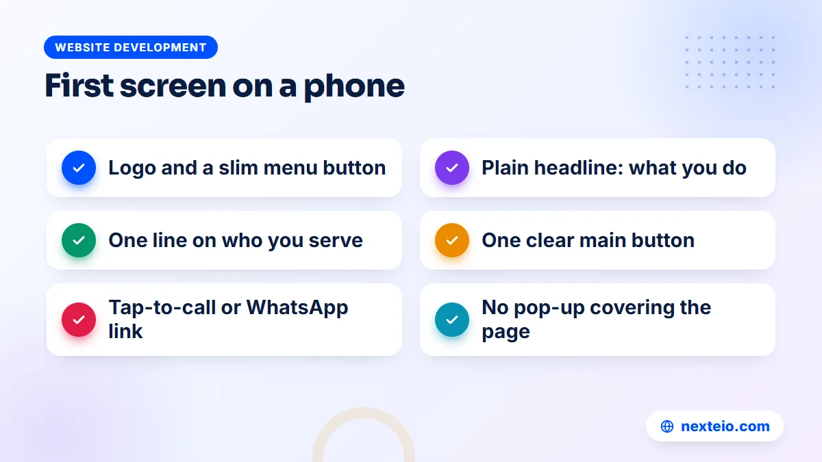
On a phone, the first screen is tiny. It usually fits the logo, a menu button, the headline, one supporting line and one button. That is all. If your designer shows you a desktop mockup only, ask to see the phone version of the same page first.
Practical phone-first habits include:
- Body text large enough to read without zooming, and short paragraphs.
- Buttons big enough to tap with a thumb, with space between them.
- Phone numbers set as tap-to-call links, so visitors can call in one tap.
- A WhatsApp or messaging link if your team actually answers it during working hours.
- No pop-ups that cover the page as soon as it opens.
- Tables and long lists that still read well on a narrow screen.
Test on a real mid-range Android phone on mobile data, not only on office Wi-Fi with a large monitor. Ask someone outside the project to find your phone number and request a quote. Watch where they hesitate. Those small moments of confusion are what your visitors feel every day.
Speed: What Slows a Homepage Down
Speed is part of website homepage design, not a separate technical issue. A homepage that looks beautiful but takes several seconds to show anything on a phone loses visitors before they see the beautiful part. Google measures real-world loading experience through Core Web Vitals, and one of them, Largest Contentful Paint, tracks how quickly the main content appears. Google's guidance treats 2.5 seconds or less as a good result.
On most company homepages, the largest element is the hero image or slider, which is why the hero deserves careful handling. These are the usual problems and fixes:
| Element | Common problem | Better approach |
|---|---|---|
| Hero image | A huge photo uploaded straight from a camera | Resize it and serve a modern format such as WebP |
| Slider | Five large slides loaded at once | One strong image, or load extra slides only when needed |
| Background video | Autoplay video on mobile data | A still image with a play button that opens the video |
| Fonts | Several font families and weights | One or two families with only the weights you use |
| Third-party widgets | Chat boxes, social feeds and many tracking tags | Keep only what you use, and load it after the main content |
You can test your homepage for free with PageSpeed Insights, which shows both lab results and, for sites with enough traffic, data from real visitors. Look at the mobile tab first. The tool lists specific problems, and most of them are fixable without changing how the page looks.
Hosting matters as well. A website on a properly managed server with good connectivity loads faster for visitors in Bangladesh and abroad, and it does not go down when your office has load-shedding. Our article on website speed and SEO explains how faster pages help both rankings and enquiries.
Homepage SEO: Titles, Headings and Text Google Can Read
Your homepage is usually the page Google shows when someone searches for your company name. It can also rank for broader terms, but only if it contains clear, readable text about what you do. A homepage built entirely from images and sliders gives search engines very little to work with.
Start with the page title, the line that appears as the blue link in search results. A sensible homepage title combines your company name with what you do, for example "Company Name: Knit Garment Manufacturer in Bangladesh". Google may rewrite titles it finds unhelpful, and its documentation on title links explains how to write ones it is more likely to keep. Google can also show a site name above the result, and the guide on site names in Search covers how to tell Google which name to use.
Then check the structure of the page itself:
- One main heading (H1) that says what you do, usually the hero headline.
- Section headings (H2) for each block, written in plain words.
- Real text, not text baked into images, so search engines can read it.
- Links from the homepage to your main service or product pages.
- Descriptive alt text on meaningful images, such as product photos.
Keep the homepage focused on the company as a whole and let inner pages target specific services. If you try to rank the homepage for every product, it ends up ranking well for none. Our guide to on-page SEO for beginners walks through this step by step, and our SEO service handles it for companies that want ongoing work.
Homepages for Corporate Groups With Several Companies
Many Bangladeshi business groups run several sister concerns under one name: a garment unit, a packaging company, a trading arm, perhaps a real estate business. The group homepage has a harder job than a single company's page, because it has to introduce the group and route visitors to the right unit quickly.
A clear structure for a group homepage looks like this:
- A hero that introduces the group in one line, such as the sectors it works in.
- A grid of sister concerns, each with its logo, a one-line description and a link.
- A short group overview with key facts that apply to all units.
- Group-level proof, such as certifications shared across units or major milestones.
- Careers, news and a contact block that explains which unit handles what.
The big decision is whether each sister concern gets a section of the group site or its own separate website. A shared site is easier to maintain and keeps all content under one domain. Separate sites make sense when units serve very different customers, for example an export garment unit and a local consumer brand. Either way, keep the visual style consistent so visitors can tell the companies belong together.
For a group, website homepage design also has to plan for the work behind the page. Group sites often need more than a standard company template. Shared news, a central careers board and unit-level editors with limited access are easier to manage on a platform built for it. Depending on your needs, that may be a well-structured WordPress website or a Laravel web application with its own admin panel.
Best Homepage Design Habits and Common Mistakes
The best homepage design for a company is usually the one that removes the most friction, not the one with the most effects. A short list of habits covers most of what separates a clear homepage from a confusing one.
Habits worth keeping
- Write the headline last, after you have agreed what the company wants visitors to do.
- Use the same button label for the same action everywhere on the page.
- Give every section a single job, and cut sections that have none.
- Update the homepage when your business changes, not only when the site is rebuilt.
Good habits are easy to agree on and easy to forget once the project gets busy. The mistakes below tend to slip in during the final weeks, when every department adds one last request.
Mistakes that keep showing up
These are the problems that appear most often on company homepages, and each one is easy to fix:
- Welcome messages: "Welcome to our website" wastes the most valuable line on the page.
- Too many buttons: six calls to action in the hero mean none of them stands out.
- Stale news: a "Latest News" block whose newest item is two years old suggests the company has gone quiet.
- Heavy embeds: a full social media feed or a large map loaded at the top of the page.
- Leadership first: a long chairman's message above the services, which most visitors skip.
- Unreadable contrast: light grey text on white, or text placed over a busy photo.
None of these mistakes ruins a website homepage design on its own. Together, they make a company look less organized than it really is. A fresh pair of eyes, such as someone from outside the company, will usually spot them in a few minutes.
How to Brief and Approve Your Website Homepage Design
In many organizations, the homepage takes longer to approve than any other page. Several departments want space on it, senior management wants to see their priorities reflected, and comments arrive from different people at different times. A little structure saves weeks.
Prepare before the designer starts
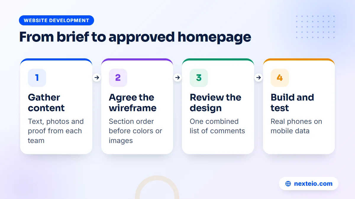
Collect the material your website homepage design will need before the first meeting. That means the one-line description of the company, the main services or product categories, and real photos. Add certification details, any client logos you have permission to use, and the primary action you want visitors to take. Ask each department for its input once, with a deadline, rather than gathering it piece by piece during design.
Agree on the wireframe first
A wireframe is a simple sketch of the page showing the order of sections and roughly what each contains, without colors or images. Approving the wireframe first means the discussion about content and order happens before anyone argues about shades of blue. It is much cheaper to move a block on a sketch than on a finished design.
Send one set of comments
Name one person on your side who collects feedback from management and departments and sends it as a single, combined list. Conflicting comments from different people are the most common reason homepage design drags on. In our experience, a company homepage with clear content and one decision-maker can move from wireframe to approved design in a couple of weeks, while the same page can take months when nobody owns the decisions.
If you are starting from scratch, our project brief form asks for most of these details up front, which makes the first conversation much more useful.
How to Tell Whether Your Homepage Is Working
Website homepage design is not finished when the page goes live. You learn the most from how real visitors use it. The good news is that you do not need expensive tools to see whether it is doing its job.
Set up Google Analytics 4 if you have not already, following Google's guide to setting up Analytics for a website. Then track the actions that matter: clicks on the phone number, the WhatsApp link, the main hero button and quotation form submissions. Page views alone tell you very little. What you want to know is how many visitors take the step you designed the page for.
Look at these signals every month or two:
- How many visitors click the main button or contact link from the homepage.
- Which menu items and service cards get the most clicks.
- Whether people searching your company name find you easily in Google Search Console.
- What your sales or front-desk team hears from callers about the website.
Make one change at a time, such as a clearer headline or a different button label, and watch the numbers for a few weeks before changing something else. If you run paid campaigns through Google Ads or Facebook ads, send that traffic to a focused page rather than the homepage. Our guide on how to build a high converting landing page explains why a page built for one offer usually turns more ad clicks into enquiries.
How Nexteio Can Help With Your Website Homepage Design
We plan and build company websites for businesses across Bangladesh, and the homepage is where we start every project. Through our custom website design service, we first sit down with you to agree who your main visitors are and what you want them to do. That conversation turns into a written section order and a wireframe for your approval, before any visual design begins.
Once the structure is agreed, we write or edit the hero headline and section copy in plain language, design the page for phones first, and build it so the main image and text load quickly on mobile data. We set up clean headings, a sensible page title and links to your service or product pages, so the homepage helps your search visibility instead of hiding it.
For corporate groups, we plan how sister concerns appear and whether each one needs its own section or site. If your current homepage only needs a clearer structure, a homepage redesign can be a project on its own. You can see examples in our portfolio, read more about how we work, send us a short project brief or reach us through the contact page.
Keep reading: our buyer's checklist for choosing a web design company, the comparison of WordPress and custom websites, or all our website development guides.
Frequently asked questions
What should be on the homepage of a company website?
At minimum, your name and logo, a plain sentence about what you do, a hint about who you serve, some proof that you are real, and one clear way to contact you or request a quote. Links to your main services or product categories come next. Mission statements, history and long messages from leadership usually fit better on the about page.
How long should a homepage be?
Long enough to answer the main questions and short enough that it does not repeat itself. For most companies, six to nine sections is plenty. If a section does not help your main visitor decide or act, move it to its own page and link to it.
Are image sliders a good idea on a homepage?
Usually not. Sliders add page weight, slow the first screen on mobile data, and many visitors never see the slides after the first. One strong, real photo with a clear headline normally does the job better. If you must show several messages, place them as separate sections further down the page.
Should our homepage be in Bangla, English or both?
It depends on who visits. Exporters and companies with foreign partners usually lead with English, while businesses serving local customers often do better with Bangla or a bilingual setup. If you offer both, keep the two versions equally up to date and put a clear language switch near the top of the page.
How often should we update our homepage?
Review it at least every few months and whenever your business changes, such as a new product line, certification or office. Small changes like a sharper headline or a new project photo can be made anytime. A full redesign is usually only needed when the structure no longer fits the business or the site is technically outdated.
Can we redesign only the homepage and keep the rest of the site?
Yes, as long as the new homepage fits the style and structure of the inner pages closely enough that visitors do not feel they have landed on a different site. If the rest of the site is old, slow or hard to update, it is often better to plan a gradual rebuild that starts with the homepage.
Who in our organization should approve the homepage design?
Name one person to collect all feedback and make final decisions, usually from marketing or the managing director's office. Department heads should give their input on content early, before design starts. This avoids conflicting comments and keeps the project moving.