Ecommerce Site Design: What Every Online Store Page Needs
In this article 16 sections
- 1.What Ecommerce Site Design Has to Do for a Store in Bangladesh
- 2.Plan the Store Before Anyone Opens a Design Tool
- 3.Homepage Design: A Shop Window, Not a Slideshow
- 4.Category, Collection and Search Page Design
- 5.Product Page Design: Where the Buying Decision Happens
- 6.Cart and Checkout Design for Cash on Delivery, bKash and Nagad
- 7.Order Confirmation, Tracking and Account Pages
- 8.Mobile-First Ecommerce Site Design
- 9.Speed: Designing for Slow Mobile Data
- 10.Trust Signals That Help Strangers Order
- 11.How Store Design Supports SEO and Paid Ads
- 12.Common Ecommerce Site Design Mistakes
- 13.What Ecommerce Site Design Costs and How Long It Takes
- 14.Before Launch: Test the Store Like a Customer
- 15.How Nexteio Can Help With Your Store Design
- 16.Frequently asked questions
Ecommerce site design decides whether a person who taps your link on Facebook places an order or closes the tab a few seconds later. For an online store in Bangladesh, design is not decoration. It is the layout of every page a buyer touches, from the first product photo to the delivery charge on the checkout screen, and the order in which those things appear on a small phone.
Most store owners judge a design by the homepage. Buyers rarely do. Many of them land straight on a product page from an ad or a shared post. Within a few scrolls they decide whether the price, photos and delivery terms make sense, and then they either order or send a message asking what the page should already have told them.
Every one of those messages is a small design failure. A clothing shop that answers "which size will fit me?" fifty times a day does not have a customer service problem. It has a product page without a clear size chart.
This guide goes through each page an online store needs, what belongs on it and why, with notes on cash on delivery, bKash and Nagad, slow mobile data and Bangla-speaking customers. It also covers the mistakes we see most often, rough costs, and a test you can run before launch.
What Ecommerce Site Design Has to Do for a Store in Bangladesh
Good design for ecommerce website projects starts with how people here actually buy. Most orders are placed on a phone, often on mobile data. Many buyers arrive from a Facebook or TikTok ad, a few from Google search, and a large share still prefer cash on delivery because they want to see the parcel before paying.
Buyers also carry a set of worries into every new shop. Is the product real or a copy? Will the size fit? How much is delivery to my district, and how many days will it take? Can I return it if it is wrong? A store that answers these questions on the page sells more than a store that waits for the questions to arrive in the inbox.
So the design has four practical jobs:
- Show the product clearly: real photos, the right details and honest prices.
- Answer the usual questions before they are asked: size, delivery charge, delivery time, payment options and returns.
- Make ordering short: as few taps and fields as possible, with no forced account.
- Build trust with a stranger: a real address, a phone number, reviews and clear policies.
Colors, fonts and banners matter, but only after these four jobs are done. A plain store that does them well will usually outsell a beautiful store that hides the delivery charge until the last step. This order of priorities is how we approach every online store we design and build.
Plan the Store Before Anyone Opens a Design Tool
The fastest way to waste a design budget is to start with how the homepage should look. Start instead with what you sell, how you deliver it and who will run the store each day. These answers shape every layout decision in your ecommerce site design. Start with the product side:
- Catalog size and structure. A shop with 30 products needs a simple menu. A shop with 3,000 products needs categories, sub-categories, filters and a strong search.
- Product data. List the variants you sell (size, color, weight, model), the details buyers ask about and any warranty terms. The product page template is built around this list.
- Photos. Decide on one image ratio, usually square or 4:5, and one background style. Mixed photo sizes make even a good design look untidy.
Then settle the rules that decide how the checkout and the admin panel will work:
- Delivery and payment rules. Which areas get cash on delivery, how the delivery charge changes by district, and whether you take bKash, Nagad or cards.
- Languages. English only, Bangla only, or both. Two languages affect menus, product names, search and fonts.
- Daily operation. Who adds products, confirms orders and updates stock. A design that staff cannot maintain will fall apart within months.
The platform comes next, and it changes what the designer can do. A WordPress and WooCommerce build suits most small and mid-sized shops and gives your team a familiar admin panel. A custom Laravel web application makes sense when you have unusual rules, such as wholesale pricing, multiple warehouses or a link to an existing stock system. Our comparison of WordPress and custom websites explains the trade-offs in more detail.
If you are still working out the budget and the full list of features, our guide to ecommerce website development in Bangladesh covers planning from the business side. This article stays with the design of the pages themselves.
Homepage Design: A Shop Window, Not a Slideshow
In ecommerce site design, the homepage has one job: help a visitor find the right section of the shop in a few seconds. Returning customers use it as a starting point, and some new visitors use it to decide whether the shop looks real. It does not need to explain everything you sell.
On a phone, the first screen should show your logo, a search box, the cart icon, one clear banner with the current offer and a row of category shortcuts. Auto-rotating sliders with five or six banners are a common habit, but they slow the page down, and most visitors never see the third slide. One strong banner that changes with the season usually works better.
| Homepage section | What it is for | Common mistake |
|---|---|---|
| Top bar with search and cart | Fast access for people who know what they want | Search hidden behind an icon on mobile |
| Main banner | The current offer or season | Five slides, heavy images, tiny text |
| Category shortcuts | Quick entry into the catalog | Icons with no labels |
| Best sellers and new arrivals | Show what is popular and fresh | Out-of-stock items still shown first |
| Trust strip | Cash on delivery, delivery time, returns | Promises the shop cannot keep |
| Reviews | Proof from real buyers | Generic five-star quotes with no names or photos |
| Footer | Contact, address, policies, social pages | No phone number or physical address |
Keep the homepage shorter than you think. Ten sections of products in different carousels make the page heavy and the scroll endless. Four or five well-chosen sections, then a clear footer, are easier to use and easier to keep updated.
Category, Collection and Search Page Design
Category pages carry most of the browsing in a real store. They also tend to rank in Google for broad searches such as "ladies kurti" or "baby diaper price", which makes them important for search traffic as well as for sales.
Product cards
Each product card in the grid should show a photo, a name of no more than two lines, the price, the old price if there is a discount, and a clear note if the item is out of stock. Two cards per row on a phone is usually right. Three makes photos too small to judge, and one wastes the screen.
Use the same image ratio for every card. When some photos are square and others are tall, the grid jumps around while it loads, and the shop looks careless.
Filters and sorting
Filters should match how buyers think about your products: size, price range, color and brand for clothing; brand, capacity and price for electronics. On mobile, put a single "Filter" button at the top that opens a full-screen panel, and show how many products match before the buyer closes it. Sorting by newest, lowest price and highest price covers most needs.
Search that forgives spelling
People in Bangladesh type product names in several ways. A buyer may search "panjabi", "punjabi" or the Bangla word, and the store should find the same products for all three. Good search also shows suggestions with small photos as the buyer types, and a no-results page that offers popular categories instead of a blank screen.
Category and search pages are where design and SEO meet most closely. A short, original description at the top of each category, clean URLs and proper headings help these pages appear in Google. Our e-commerce SEO service focuses on exactly these pages, and the guide on what ecommerce SEO includes explains the work behind them.
Product Page Design: Where the Buying Decision Happens
If your ecommerce site design budget only allows you to perfect one template, make it the product page. This is the ecommerce web page design that most ad traffic lands on, and it decides most sales. The order of elements matters as much as the elements themselves, because a phone shows only a small slice at a time.
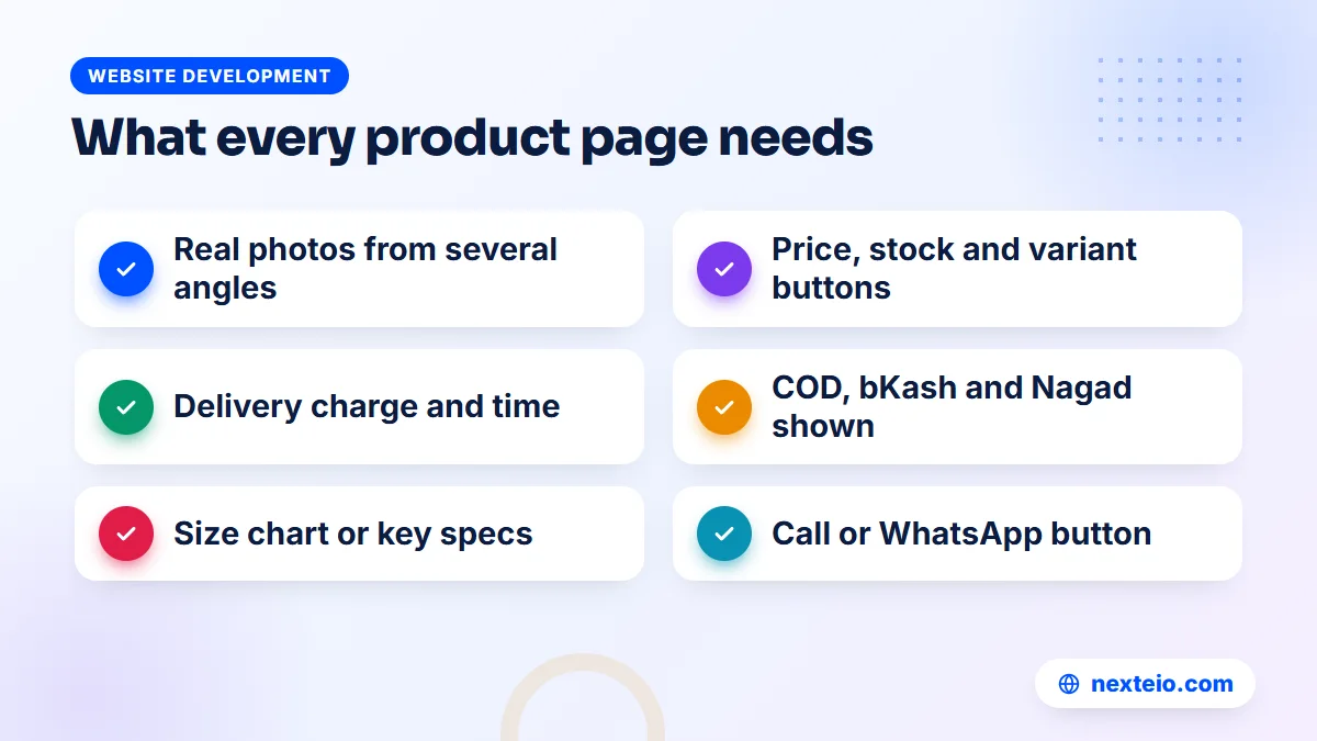
A strong order on mobile looks like this:
- Photo gallery that swipes, with zoom and, if possible, a short video.
- Product name and price, with the discount shown honestly.
- Variant buttons for size or color, showing which options are out of stock.
- Stock status and the expected delivery time.
- Delivery charge by area and the payment options, such as cash on delivery, bKash and Nagad.
- "Add to cart" and "Buy now" buttons, plus a call or WhatsApp button for questions.
- Key details in short bullet points, then the longer description.
- Size chart, warranty or ingredients, depending on the product.
- A short return and exchange summary with a link to the full policy.
- Reviews, ideally with buyer photos, then related products.
Variant buttons work better than dropdown menus on a phone. A buyer can see all sizes at once, and a crossed-out size tells them immediately that it is sold out, instead of after they reach the cart.
Details that depend on what you sell
Clothing shops need a size chart in inches or centimeters, measured from the actual garment, plus a photo on a person with their height noted. Electronics shops need the model number, warranty period and who honors the warranty. Cosmetics and food shops need ingredients, expiry information and, where relevant, whether the item is imported. These are the details that stop a buyer from ordering, or from returning the parcel at the door.
Photos and video
Real photos of the actual product beat supplier photos every time, because buyers have learned that supplier photos often do not match what arrives. Show the product from several angles, close up on the fabric or finish, and next to something familiar for scale. A ten-second video of the product being handled answers questions that no description can. If you need short clips for both the product page and your ads, our video ads editing service can cut one set of footage into both.
Product pages are also where structured data belongs. Marking up the name, price, availability and reviews helps Google understand the page and can make it eligible for richer search results. Google's guide to product structured data lists what it reads, and the vocabulary itself is defined at schema.org.
Cart and Checkout Design for Cash on Delivery, bKash and Nagad
The checkout is where buyers most often leave without a word. Each extra field, each surprise charge and each forced step costs orders. Good ecommerce page design at this stage is mostly about removing things.
Ask for less
Let people order as guests. Forcing an account before the first purchase sends many buyers back to the inbox to order by message instead. For most shops in Bangladesh, the checkout needs only these fields:
- Full name.
- Mobile number, checked for the usual 11-digit format starting with 01.
- District, chosen from a list, and then the area or upazila.
- Full address, with a landmark if the buyer wants to add one.
- An optional note, such as a preferred delivery time.
Email can be optional. Many buyers do not check it, and the phone number is what the courier and your team will use. Mark the fields with the correct autocomplete settings, described in MDN's guide to the autocomplete attribute, so phones can fill in the name, number and address with one tap.
Show the delivery charge early
A delivery charge that appears only at the last step feels like a trick, even when it is fair. Show the charge range on the product page, calculate the exact amount as soon as the buyer chooses a district, and keep the full total visible on the checkout screen. If cash on delivery orders outside certain areas need the delivery charge paid in advance by bKash or Nagad, say so on the product page as well, not only at checkout.
Payment options in plain view
List the payment options as large, tappable choices: cash on delivery, bKash, Nagad, and cards through a payment gateway if you offer them. If you take mobile banking payments manually rather than through a gateway, show the account number and a field for the transaction ID, with short instructions. Keep the coupon field small. A large empty coupon box sends some buyers off to search for codes, and some never come back.
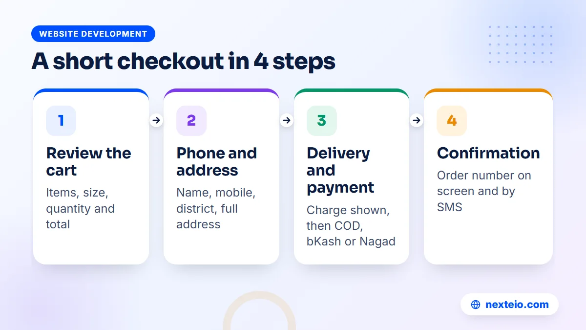
On a phone, one scrolling checkout page usually beats a multi-step wizard, as long as the order summary stays visible and the button text says exactly what happens next, such as "Place order, pay on delivery".
Order Confirmation, Tracking and Account Pages
Design work often stops at the "Place order" button. For the buyer, the next screen matters just as much, especially with cash on delivery, where they have paid nothing yet and may change their mind.
The confirmation page should show the order number, a summary of what was ordered, the total to be paid, and what happens next in plain words. For example: "We will call you to confirm this order before shipping. Delivery usually takes two to five days." Send the same details by SMS. A buyer who knows what to expect is far less likely to refuse the parcel.
This page is also where your ad tracking records a purchase. If the Meta Pixel or Google tag does not fire on the confirmation page, your ad reports will show clicks but no sales, and budget decisions will be made in the dark. Our guide to Meta ads conversion tracking covers the setup, and our Facebook ads service includes it as part of campaign work.
For returning buyers, add an order tracking page that works with a phone number and order number, without a login. A simple account area with order history, saved addresses and a reorder button helps shops that sell repeat items such as baby products, groceries or cosmetics. Keep it simple. Most customers will only use these pages a few times.
Mobile-First Ecommerce Site Design
Mobile-first means the phone layout is designed first and the desktop version is adapted from it, not the other way around. For most stores here, the phone is where the large majority of visits and orders happen, so a design that is approved only on a large office monitor is approved on the wrong screen.
A few rules make a large difference on small screens:
- Put the main buttons where thumbs reach, and keep a sticky "Add to cart" bar at the bottom of product pages.
- Make buttons and links big enough to tap without zooming, roughly the size of a fingertip.
- Use at least 16px text in form fields, so iPhones do not zoom in when a field is tapped.
The next three are easy to forget during design reviews:
- Avoid popups that cover the page as soon as it opens. Google warns that intrusive interstitials can hurt the mobile experience.
- Keep the menu short, with search always one tap away.
- Test on a mid-range Android phone on mobile data, not only on the designer's own phone over office Wi-Fi.
Bangla text needs its own check. Bangla characters often need a slightly larger font size and more line height than English to read comfortably, and some fonts render conjuncts badly. Choose a Bangla font that is tested on Android, and limit the number of font weights you load.
Speed: Designing for Slow Mobile Data
Ecommerce site design choices decide most of a store's speed before a developer writes any code. A homepage with a six-image slider, three carousels, a video background and a chat widget will be slow on any platform. Many buyers are on mobile data with a weak signal, and a store that takes too long to show the first product loses them before they see anything.
The main speed rules for store design are simple to state:
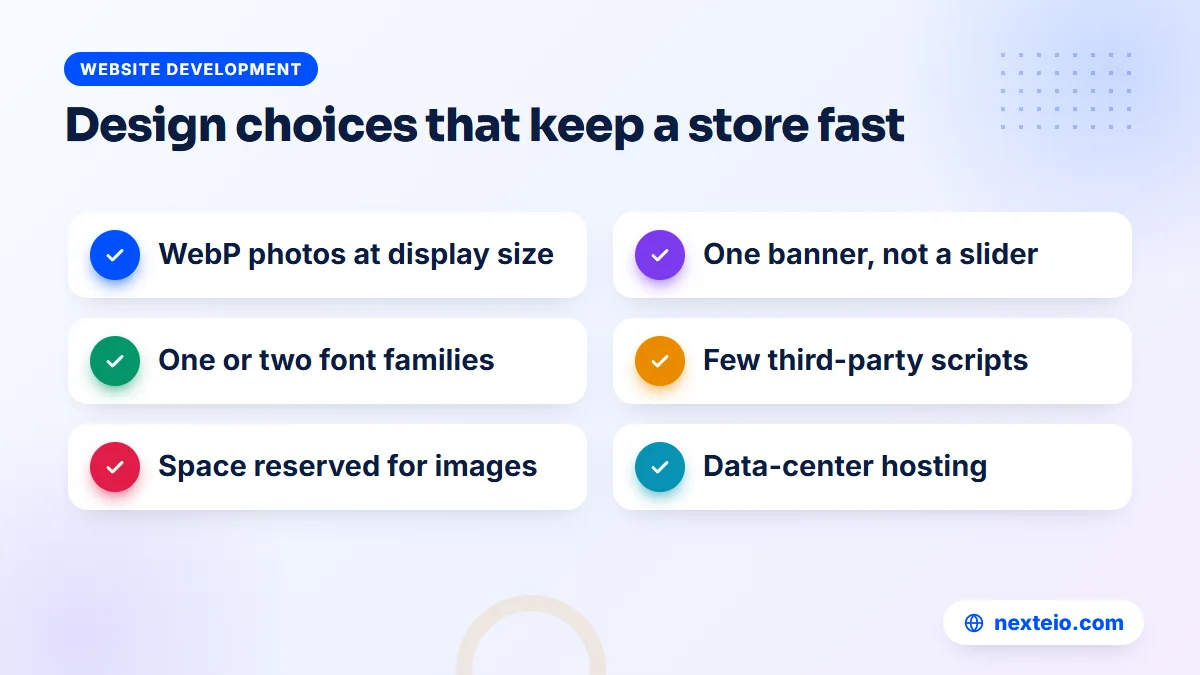
- Export product photos at the size they are shown, in WebP, and lazy-load images below the first screen.
- Load one or two font families at most. Bangla web fonts can be large files.
- Limit third-party scripts. Every chat widget, tracking tag and review app adds weight.
- Reserve space for images and banners so the page does not jump while it loads.
- Host the store on a proper data-center server, not a machine affected by load-shedding at an office.
Google measures real-world loading, responsiveness and visual stability through its Core Web Vitals, and these are worth checking on your main product and category pages. Our article on website speed and SEO explains how faster pages help with both rankings and orders.
Trust Signals That Help Strangers Order
A first-time buyer is sending money, or at least committing to accept a parcel, to a shop they have never seen in person. Trust is part of ecommerce site design, not an extra. These are the signals buyers in Bangladesh look for:
- A phone number that someone answers, shown in the header or footer.
- A physical address, even if it is a small office or warehouse.
- A link to the shop's Facebook page with real activity and comments.
- Clear pages for delivery, returns and exchanges, refunds and privacy.
- Reviews from real buyers, ideally with photos, including a few that are not perfect.
- An "About us" page with a short, true story of who runs the shop.
Avoid tricks that buyers have learned to distrust. Fake countdown timers that reset on every visit, invented "15 people are viewing this" notices and discounts on prices that were never charged may lift sales for a week, but they damage the shop's name. If you want to understand why visitors arrive and still leave without ordering, read why a website gets traffic but no customers.
Related guides for store owners planning a new design:
- How to create a high converting landing page for Google and Meta ads
- How to write SEO-friendly website content that people read
- How to build a professional business website that gets results
How Store Design Supports SEO and Paid Ads
The way you design e commerce website pages affects how easily people find them. Search engines need to understand each page, and ad platforms need a page that matches the ad. The same design can either help or hurt both.
Search
Give every category and product its own clean URL, a single clear H1 and an original description rather than text copied from the supplier. Add breadcrumbs so both buyers and Google understand where a product sits in the catalog. Handle out-of-stock products sensibly, keeping the page live with a "back soon" message if the item will return. Google's own guide to ecommerce sites in Search covers URL structure, pagination and product data in detail.
Ads
When you run ads, the page the ad points to should show the same product, price and offer the ad promised. Sending every ad to the homepage forces buyers to search again, and many will not. For a campaign around one product or offer, a focused landing page built from your product template, with fewer distractions, often performs better. Short product videos made for ads can also be reused on that page.
Design also has to leave room for tracking. The purchase event, the add-to-cart event and the checkout start should all be measurable, so you can see which ads bring buyers and which only bring clicks.
Common Ecommerce Site Design Mistakes
Most problems in store designs are not about taste. They are about missing information and extra steps. These come up again and again when shops ask us to review a store that is getting visits but few orders:
- The delivery charge appears only at the final checkout step.
- No size chart, or a size chart copied from a different brand.
- Supplier photos that do not match the product that arrives.
- Account registration forced before the first order.
- Long checkout forms asking for email, postcode and company name.
- Out-of-stock sizes shown as available until the cart.
- Heavy sliders and video backgrounds that slow the first screen.
- No phone number or address anywhere on the site.
- A desktop design shrunk down for phones instead of designed for them.
- Prices shown as "message for price", which sends buyers to the inbox or to a competitor.
Several of these can be fixed in a day. Others, such as a checkout built around the wrong rules, are a reason to rethink the store.
What Ecommerce Site Design Costs and How Long It Takes
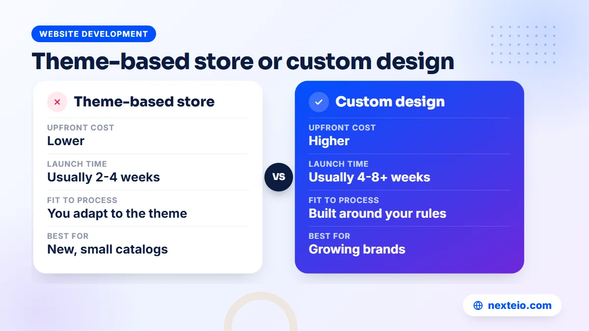
What ecommerce site design costs in Bangladesh varies widely, and the number of pages matters less than the number of templates, features and integrations. These are rough market ranges, not fixed prices, and they depend heavily on the provider and the scope.
| Type of store build | Rough market range | Usual timeline | Suits |
|---|---|---|---|
| Theme-based store, light changes | BDT 25,000 to 60,000 | 2 to 4 weeks | New shops with a small catalog |
| Custom-designed store on WooCommerce | BDT 60,000 to 150,000 | 4 to 8 weeks | Growing brands that want their own look |
| Custom build with integrations | BDT 150,000 and above | 8 weeks or more | Large catalogs, wholesale rules, stock or ERP links |
Hosting, the domain, payment gateway fees, SMS costs and paid plugins are usually billed separately. Product photography and entering hundreds of products are also extra work that many quotes leave out, so ask about them early. Our e-commerce website service page lists what a store project usually includes.
Before you accept a quote, ask the designer a few direct questions. Will they design the product page and checkout on mobile first and show you those screens before the homepage? Who will enter the products? How will delivery charges be calculated? Can they show stores they have designed, and can you place a test order on one? You can see the kind of sites we build in our portfolio, and if you would like a quote based on your catalog and delivery rules, tell us about your store on our project form.
Before Launch: Test the Store Like a Customer
An ecommerce site design that looked right in mockups can still fail in real use. Before you announce the store or turn on ads, ask two or three people who did not build it to place real orders on their own phones, while you watch without helping. Then work through this checklist:
- Find a product by search, using a spelling mistake.
- Filter a category by size and price, then clear the filter.
- Open a product, choose a variant and check the delivery charge for two different districts.
- Place an order with cash on delivery, and another with bKash or Nagad.
- Confirm that the order email or SMS arrives, and that the order appears in the admin panel.
- Check that the purchase shows up in your ad tracking.
- Open the store on a slow connection and note what loads first.
- Read the delivery, return and privacy pages for mistakes.
Every point where a tester hesitates, asks a question or taps the wrong thing is a design fix. These fixes are cheap before launch and expensive once ads are running.
How Nexteio Can Help With Your Store Design
We design and build online stores through our ecommerce website development service, and we start where this guide starts: with your products, your delivery rules and the way your buyers order. That means designing the product page and the checkout on a phone first, around cash on delivery, bKash and Nagad, district-based delivery charges and the questions your team answers every day in the inbox.
We build on WooCommerce when your team needs a familiar admin panel, and as a custom Laravel application when your process needs rules a standard plugin cannot handle. In both cases we keep the pages light for mobile data, set up the basic tracking your ads need, and hand over a store your staff can manage. If you already have a store that gets visits but few orders, we can look at the design and tell you what to fix first.
You can read more about Nexteio, see the details of our online store design and development work, share your store plan on our project form or reach us through the contact page.
Keep reading: Google Ads conversion tracking for beginners, a buyer's checklist for choosing a web design company, or browse all our website development guides.
Frequently asked questions
What pages does an online store need at launch?
At minimum you need a homepage, category pages, product pages, a cart and checkout, an order confirmation page and policy pages for delivery, returns, refunds and privacy. An about page and a contact page with a phone number and address help new buyers trust you. An order tracking page and a customer account area can follow once orders grow.
Should an online store in Bangladesh force customers to create an account?
Usually not. Guest checkout with a name, mobile number and address is enough for most orders, and forcing registration sends many first-time buyers back to Facebook Messenger or to another shop. You can offer an account after the order, using the details they already entered.
Is a ready-made theme good enough for an ecommerce store?
For a new shop with a small catalog, a well-chosen theme with careful changes to the product page and checkout can work well and keeps the cost down. The theme should be light, mobile-friendly and actively updated. Once you have many products, special pricing rules or integrations, a custom design usually pays for itself.
How should delivery charges be shown on an online store?
Show the charge range on the product page, calculate the exact amount as soon as the buyer chooses a district at checkout, and keep the full total visible before the order button. If some areas need the delivery charge paid in advance for cash on delivery, say so early. Surprise charges at the last step are one of the most common reasons buyers leave.
What image size and format should product photos use?
Pick one ratio for the whole store, usually square or 4:5, and export each photo at roughly the size it is displayed, in WebP where possible. Keep a larger version for zoom on the product page only. Consistent sizes keep category grids tidy and stop the page from jumping while it loads.
Can I add bKash and Nagad payments to my store design later?
Yes. Many stores launch with cash on delivery and manual mobile banking payments, then add a payment gateway later. Plan the checkout layout with space for these options from the start, so adding them later does not mean redesigning the page.
How do I know if my store design is losing orders?
Look at where visitors drop off: many product views but few add-to-cart actions points to the product page, while many carts but few orders points to the checkout. Watch two or three people place an order on their phones without help, and note every hesitation. Repeated inbox questions about size, delivery or price also show which details the pages are missing.